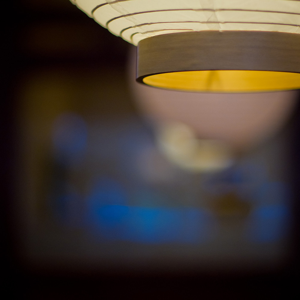
I seem to be enamored by the colour blue, and especially the relationship between blue and orangey/yellow, its either too much CSI:Miami or Michael bay, I havent figured out yet which, maybe the reason they use these tones together is because they work well? http://www.slashfilm.com/orangeblue-contrast-in-movie-posters/
This was taken in the sushi restaurant and sticks oto the formula of wide open ( f1.4) and indoor ISO ( 800) I moved around a bit to getthe look I wanted , specifically the lantern in focus and the reflection off the window of the blue sign lights outside.
Once again the Super MC Takumar comes through with flying colours ( literally!) and the out of focus lighting is nice and smooth
Subscribe to:
Post Comments (Atom)


No comments:
Post a Comment